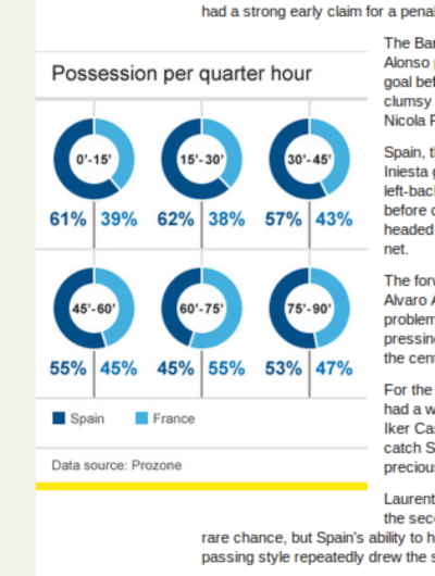
Over-egging the infographic pudding
24 Jun 2012

This over-the-top infographic set off my geek alarm bells today. A one-dimensional time-dependent variable presented as six two-dimensional charts. For good measure, a trivial complementary variable has been calculated and included, along with the numerical value of both variables to an excessive degree of precision.
The BBC website is brilliant at things like this. A couple of favourites from the past:
- BBC mistake computer game logo for UN Security Council symbol
- “if the government was a mouse this week, the psychedelic view inside its head might resemble that of a little hippy, addicted to LSD. To be more serious, take immigration."
Tags: data, infographic, bbc, journalism
< Previous post | Next post >Favourite posts
- On wiggly lines and being normal
- On infinite villages
- Running a race backwards
- Brainmaking
- Their tables were stored full, to glad the sight
- The structure of a smell
Recent posts
- Start your holidays with a meta-alarm
- PGN files from handwritten chess notation
- Souvenirs des villes européennes
- Pic'n'mix reinvented
- Super slow-mo Tetris
Blog archives
Posts from 2012, 2013, 2014, 2015, 2016, 2017, 2018, 2019, 2020, 2021, 2022, 2023, 2024.